55. Istanbul Jewelry Show | 17 - 20 April 2024
56. Istanbul Jewelry Show | 02 - 05 October 2024
Venue | Istanbul Expo Center

The Key Colours for A/W 24/25 by WGSN and Coloro
Estimate Reading Time: 3 min
Published on November 2023
WGSN and Coloro have unveiled the main colors for Autumn/Winter 2024/2025. These colors align with factors influencing consumers, including health, creativity, the environment, and technology. The key colors include Intense Rust, Midnight Plum, Sustained Grey, Cool Matcha, and Apricot Crush. Especially in a period where uncertainties about the future persist, global color forecasts reflect consumers' interests in health, creativity, the environment, and technology.
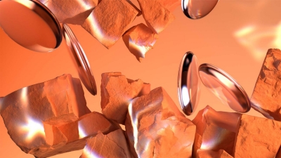
Colour of the Year 2024: Apricot Crush
WGSN initially identified Apricot Crush as a key color for A/W 23/24, emphasizing a focus on balanced lifestyles promoting physical and mental well-being. Its elevation to the Color of the Year 2024 underscores the significance of orange as a versatile, year-round shade. Aligned with WGSN's dedication to color longevity and sustainability, Apricot Crush's restorative qualities make it appealing in fashion, beauty, interiors, and consumer tech. This vibrant hue, akin to an activating vitamin tone, embodies a holistic approach to health, drawing inspiration from the natural benefits of apricots and oranges. In times of uncertainty, Apricot Crush remains crucial, symbolizing hope and positivity through its association with nature's beauty.
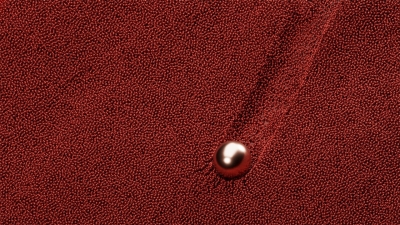
Intense Rust
Intense Rust, initially forecasted for A/W 23/24, reemerges as a key color in the palette for A/W 24/25. This transseasonal brown exudes warmth and richness, invoking a sense of stability. Striking a balance between luxury and a raw, earthy quality, Intense Rust resembles soil, offering warmth and calming textures. It reflects a shift in consumer values towards sustainability, embracing resale culture, and prioritizing long-term appeal over novelty. The color communicates authenticity, understated luxury, and encourages a resurgence of classic design principles.
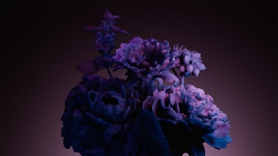
Midnight Plum
Midnight Plum, a potent dark purple, draws inspiration from themes of space exploration and the metaverse. Images from NASA's James Webb Telescope, delving into the mysteries of the universe's origins, have influenced the connection between colors in space and our imaginations. This tinted dark, verging on black, embraces darkness, evoking a sense of mystery, and resonating with gothic and underground sentiments. Aligned with the growing consumer desire for escapism, Midnight Plum captures the allure of the unknown and celestial exploration.
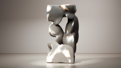
Sustained Grey
Sustained Grey underscores the enduring significance of neutrals and sustainable color choices, celebrating recyclability and a commitment to a 'just enough' approach. Symbolizing practicality and reliability, this color serves as a foundational and grounding element with a utilitarian edge. It advocates for balance and a decelerated pace, embodying a timeless hue with transseasonal and long-term appeal.
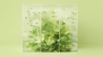
Cool Matcha
Cool Matcha, a tinted pastel, exudes a soothing and calm quality. Bridging the gap between nature and technology, it emphasizes advancements in nature-powered bio and plant-based materials, dyes, pigments, and energy sources. Addressing consumers' ongoing feelings of anxiety and stress, this color aims to soothe the mind and evoke a sense of rest and reflection. Cool Matcha, with its quiet and pacifying pale shade, possesses therapeutic qualities, seamlessly blending a vegetal green with a mindful pastel, creating a harmonious combination.
The colors identified by WGSN and Coloro offer diverse and impactful usage in the jewelry sector. Apricot Crush stands out as a prominent shade among these colors. This warm and organic hue holds the potential to create a unique and impressive atmosphere in jewelry designs. Symbolizing a healthy lifestyle and positive energy, Apricot Crush is an ideal choice to infuse vibrancy and freshness into jewelry designs. Intense Rust, with its warm and rich tone, can bring stability to jewelry designs, making it a distinctive element. Midnight Plum, associated with space exploration and the metaverse theme, can serve as a source of inspiration for mysterious and sophisticated jewelry pieces. Sustained Grey, aligned with sustainability emphasis, can add elegance to minimalist designs or refined cuts in stones. Cool Matcha, blending nature and technology, can find application in serene and contemporary jewelry designs. Emphasizing the importance of advancements in bio and plant-based materials, this color can attract attention. Overall, this color palette provides jewelry designers with a broad creative space, allowing the creation of unique pieces in various styles that cater to customer expectations.
If you like this content, please click here to read other contents
Don't Forget to Share!

Sign-up our newsletter to stay up-to-date.
Subscribe to Istanbul Jewelry Show newsletter to stay up-to-date with the latest news from Istanbul Jewelry Show, including event information and industry insights
Organiser

Supporters


Istanbul International Jewelry, Watch & Equipment Fair
Follow Us
Partners

Republic of Türkiye Ministry of Trade

Jewellery Exporters' Association

KOSGEB
Quick Links
THIS FAIR IS HELD UPON THE AUTHORIZATION OF THE UNION OF CHAMBERS AND COMMODITY EXCHANGES OF TÜRKİYE, IN ACCORDANCE WITH LAW NUMBER 5174.